Context
TL;DR
- What it was:
A foundational design project to systematise government transactions through a modular SaaS platform - What I did:
Led strategy, research, standardisation, and design ops across a team of 10 - Why it mattered:
Cut delivery time, reduced cost, and enabled scaling of digital services to more agencies - What it shows:
I don’t just design, I build design capability and strategy with commercial impact
📘 About the project
🧠 Business goals
- Uncap business capacity to take on new work, generating new revenue
- Reduce maintenance costs by 80%
- Increase speed to market by 50%
- Enable smaller agencies to go digital affordably
- Deliver consistent, accessible, and trustworthy experiences
- Increase velocity of design activities by 80%
Challenges & Insights
A legacy of inconsistency

- Redundant solutions for identical problems
- Fragmented flows across similar transaction types
- Components being re-invented repeatedly
📈 Opportunity: Create modular, flexible templates from our years of implicit knowledge
We were turning buried expertise into repeatable, scalable tools

Strategy & Process
🧩Strategy: From chaos to codified knowledge
1. Standardise components
2. Create transaction templates by category
For horizon one, I developed a five step process to take us from an incongruous mess through to a fully standardised advanced component library.
This strategy incorporated:
- Operational systems that observed risks and dependencies surfaced in the workshops
- A prioritised roadmap that was aligned with all stakeholders and key team milestones
- A method for running both the design of our flagship TaPaaS transactions and component standardisation simulataneously
- Robust documentation for handovers during a organisational restructure, conferring confidence in new team members and providing easy-to-access justification for all design decisions
⚙️The Process
1. Audit
Mapping the Mess
We conducted a comprehensive audit of approximately 20 existing transactions, evaluating each component through the lenses of form (visual design) and function (purpose). This dual analysis allowed us to identify inconsistencies where components either looked different but served the same function or appeared similar yet operated differently.
2. Prioritisation
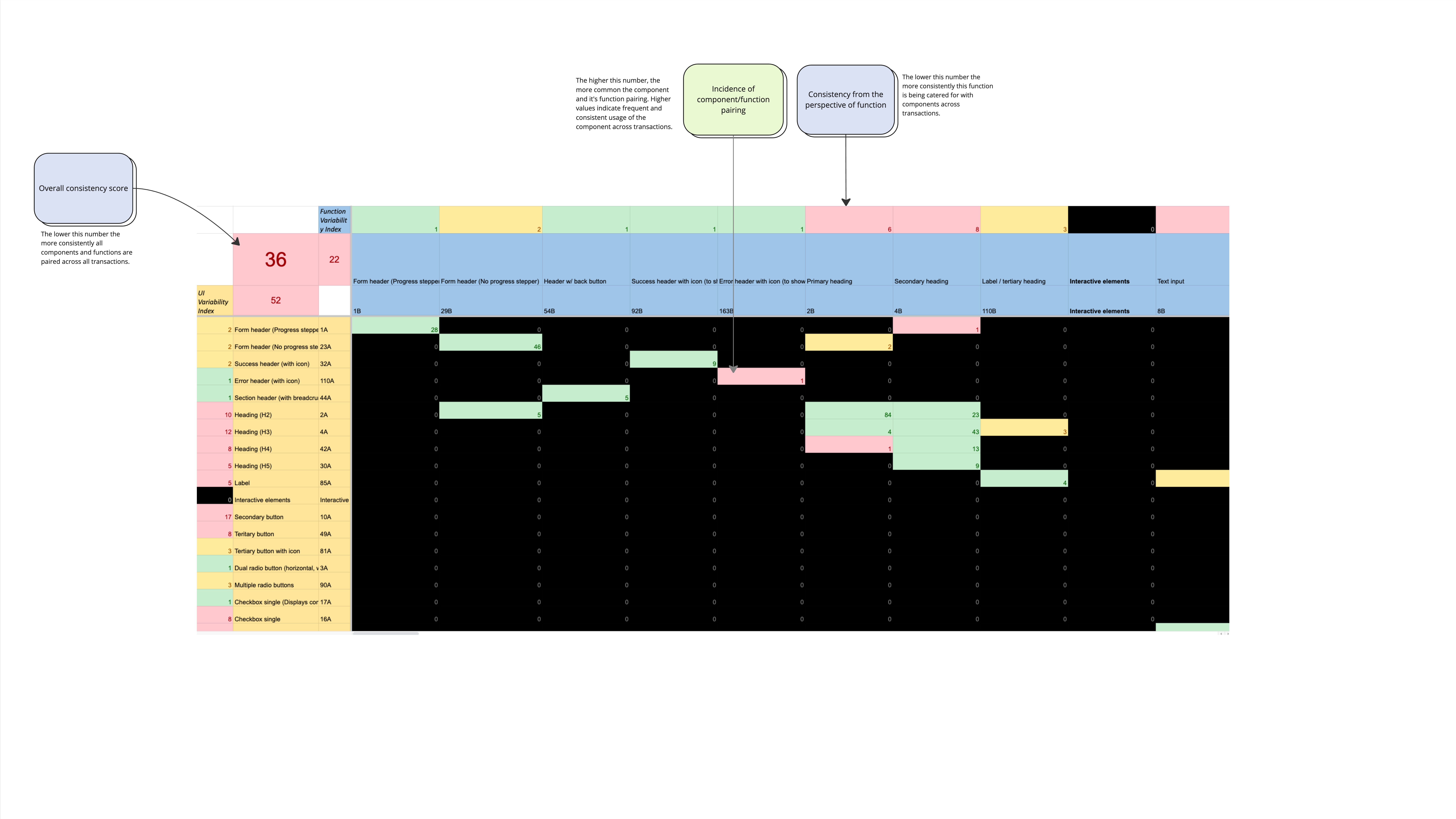
The Heat Map
All of the codes from the form and function audit were plugged in to an enormous spreadsheet that was coded to output a heatmap. The heatmap indicated which components were being used consistently (effecively already standardised) and which were inconsistent and to what degree.
This enabled us to focus by excluding certain components from later step in the process, and prioritise those we knew were going to be more time consuming—frontloading high-effort tasks, and de-risking the potential of these to affect our delivery timeline.
3. Collation
Refining the Picture
While auditing with six designers, it was difficult to eliminate the prospect of codes being created that were the same but named differently, or that were similar and overlapped. Additionally, many components appeared to fall into groups that would naturally make sense to standardise together. As a result, components were grouped based on common shared "function".
All component examples were exported and highlighted providing us with a clearer image of what we were working with, and allowing us to move on to design.
4. Design & Ratification
Heuristic Analysis Framework
Designers compared UI variations using a heuristic framework to determine the ideal standard, selecting the best design elements from groups of components and synthesising them together. Each component was stress tested in all relevant contexts to ensure future-proofing.
The Design Council
A regular cadence was established for the convening of a design council that reviewed the proposed components making recommendations until they were unanimously satisfied that the ideal standard had been achieved.
5. Documentation
Creating the Library
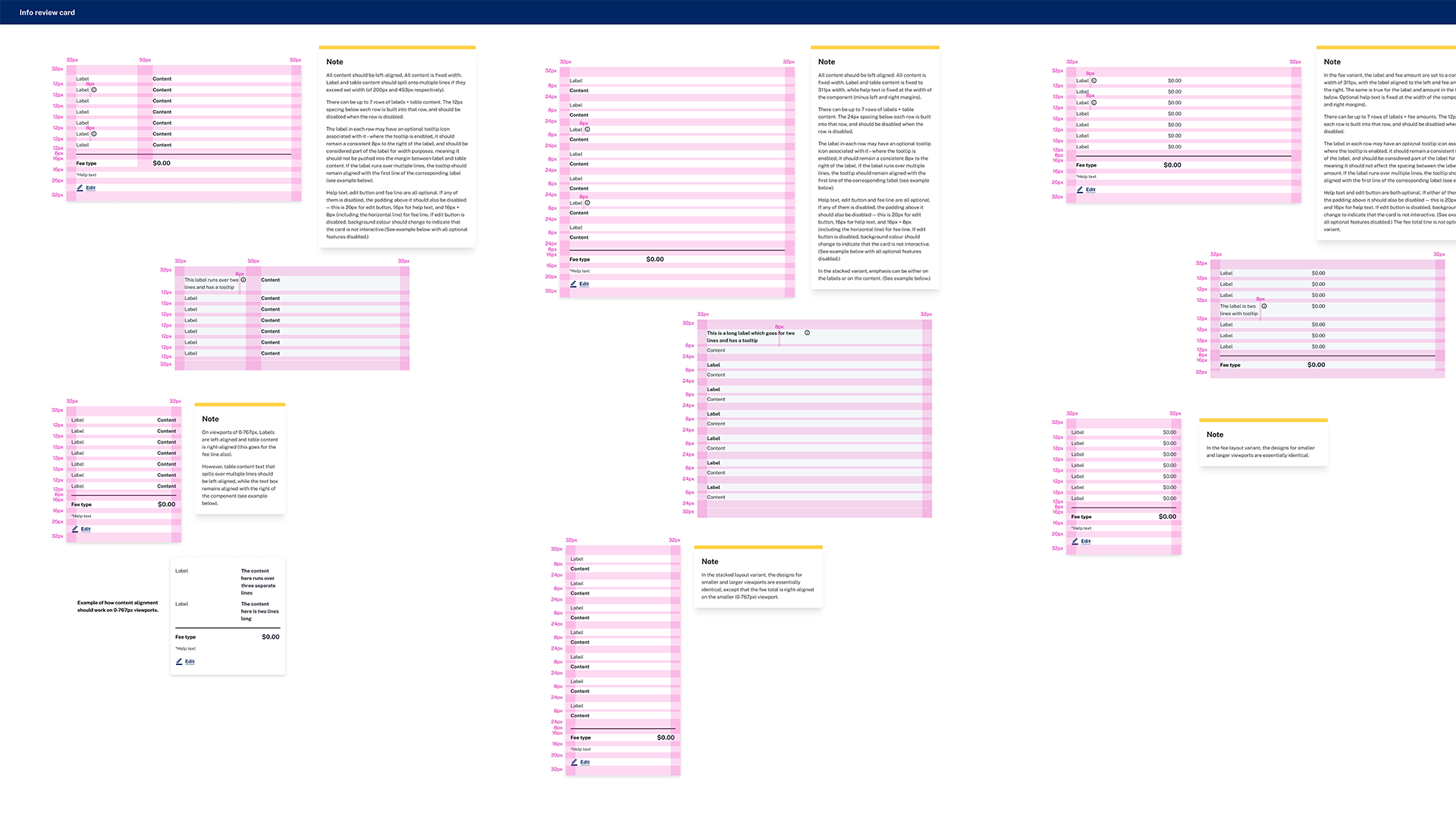
Finalised components were created and documented in Figma templates, detailing:
- Design rationale
- Component functionality
- Variants, states, and use cases
- Component anatomy
- Do’s and don’ts for implementation
- Develoloper notes
- Accessibility considerations
.gif)
Outcomes
⌨️Design Outcomes
Component Standardisation
This unification not only significantly speeds up design work and build, but also enhances usability, trust, and reputation.
Design System Integration
The Figma library references GEL wherever possible, ensuring that any updates made to GEL are inherited and flow though to TaPaaS automatically.
Transaction Templates
Component Standardisation
Successfully consolidated ~160 disparate UI components into ~30 standardised essential advanced components with their necessary variants.
This unification not only significantly speeds up design work and build, but also enhances usability, trust, and reputation.
Design System Integration
Seamlessly integrated the new design system with the base Service NSW GEL design system, enabling users to use both to meet their needs in any design context.
The Figma library references GEL wherever possible, ensuring that any updates made to GEL are inherited and flow though to TaPaaS automatically.
Transaction Templates
Laid the foundation for categorised transaction templates to be created, streamlining the design process for new projects even further, and enabling the team to give accurate quotes to prospective client agencies.
4. Design & Ratification
Seamlessly integrated the new design system with the base Service NSW GEL design system, enabling users to use both to meet their needs in any design context.
The Figma library references GEL wherever possible, ensuring that any updates made to GEL are inherited and flow though to TaPaaS automatically.
5. Documentation
Seamlessly integrated the new design system with the base Service NSW GEL design system, enabling users to use both to meet their needs in any design context.
The Figma library references GEL wherever possible, ensuring that any updates made to GEL are inherited and flow though to TaPaaS automatically.
- Component Standardisation:
Successfully consolidated ~160 disparate UI components into ~30 standardised essential advanced components with their necessary variants.
This unification not only significantly speeds up design work and build, but also enhances usability, trust, and reputation. - Design System Integration:
Seamlessly integrated the new design system with the base Service NSW GEL design system, enabling users to use both to meet their needs in any design context.
The Figma library references GEL wherever possible, ensuring that any updates made to GEL are inherited and flow though to TaPaaS automatically. - Transaction Templates:
Laid the foundation for categorised transaction templates to be created, streamlining the design process for new projects even further, and enabling the team to give accurate quotes to prospective client agencies.
📊Business Impact
Operational Efficiency
Cost Savings
Revenue Growth
- Operational Efficiency:
The elimination of unique components and the introduction of templates drastically reduces engagement, design, and development effort, leading to faster project turnaround. - Cost Savings:
[insert figures] TaPaaS calculates that the impact of these updates to operational efficiency will result in approximately $800K in savings per project (depending on size and scope). - Revenue Growth:
The increased capacity to take on new projects, enabled by the changes to our design process and corresponding build framework, is uncapping the organisation's capacity for growth. TaPaaS is currently drawing a lot of attention from senior leadership and is in line to become Service NSW's greatest asset.
💭Reflection
Challenges Encountered
Working on a project of this size and scope, and through an extending period of restructuring presented many challenges.
With reporting lines tangled or severed, loss of domain knowledge, flagging motivation, and being in the limelight, it was crucial to keep a level head and work alongside decision-makers to align, strategise and execute.
Additionally, working with the sheer amount of data (components-wise) and ensuring that the design team was able to visualise the end goal, making decisions and creating artefacts that stood up to interrogation, was a looming challenge that required consistent vigilance and effort.
Lessons Learned
1. Standardisation Doesn’t Mean Rigidity, It’s a Foundation for Agility
When we began standardising components, some stakeholders feared it would stifle creativity or flexibility across different agencies. What we learned is the opposite: well-designed standards actually unlock creativity by removing low-level decision-making and allowing teams to focus on real problem-solving.
2. Design Systems Are Business Tools, Not Just Design Tool
This project reinforced that design systems aren’t about visual consistency alone—they’re about scaling expertise, reducing cost, and removing friction from delivery. We saw how reusable components lowered onboarding time for new designers and reduced dependencies on specialist knowledge.
3. Collaboration Beats Consensus
In a cross-functional environment like government, perfect consensus is rare—and often unnecessary. The turning point was realising that alignment doesn’t mean agreement on everything, but rather shared ownership of a direction. Designing the ratification process to invite critique while protecting momentum was key.
Future Considerations
1. Evolving the System into a Design Platform
With the component library and transaction templates in place, the next opportunity is to turn TaPaaS into a design platform, not just a design system. That means enabling designers, developers, and product owners to self-serve configurations, preview builds, and collaborate without starting from scratch every time.
2. Layering in Data and Performance Metrics
To ensure the system remains useful and relevant, we’ll need to integrate feedback loops. This includes tracking component usage, adoption rates across agencies, and tying design performance to business metrics like completion rates and support tickets.
3. Cross-Agency Adoption Strategy
Now that the core is built, expanding TaPaaS into more agencies will require change management, training, and support infrastructure. We’ll need a dedicated onboarding framework, documentation, and clear communication of the value proposition, particularly for smaller agencies with limited digital capability.
4. Governance Without Bottlenecks
As more teams adopt the system, governance must evolve. A lightweight review framework, periodic design councils, and clear contribution models will help us maintain quality and consistency without becoming a bottleneck.
5. Improving Accessibility from the Start
Accessibility was a core part of our standards, but there’s always more to do. In future iterations, we want to build in accessibility testing and validation at the component level, using tooling that helps catch issues early and often.
6. Templating End-to-End Journeys
Right now, we’ve templated individual transactions. The next frontier is composing those transactions into full user journeys e.g., life events, business registrations, licensing processes. That requires smart orchestration, progressive disclosure patterns, and continuity of context.
7. Bridging Design and Development More Seamlessly
Though we’ve built handoff-ready documentation, there’s more to explore in bridging the gap between design files and front-end implementation, possibly through component libraries in code (e.g. Storybook, Figma Tokens, or design-to-code pipelines).


